islr notes and exercises from An Introduction to Statistical Learning
3. Linear Regression
Exercise 8: Simple regression of mpg on horsepower in auto dataset
Preparing the dataset
Import pandas, load the Auto dataset, and inspect
import pandas as pd

auto = pd.read_csv('http://www-bcf.usc.edu/~gareth/ISL/Auto.csv')
auto.head()
| mpg | cylinders | displacement | horsepower | weight | acceleration | year | origin | name | |
|---|---|---|---|---|---|---|---|---|---|
| 0 | 18.0 | 8 | 307.0 | 130 | 3504 | 12.0 | 70 | 1 | chevrolet chevelle malibu |
| 1 | 15.0 | 8 | 350.0 | 165 | 3693 | 11.5 | 70 | 1 | buick skylark 320 |
| 2 | 18.0 | 8 | 318.0 | 150 | 3436 | 11.0 | 70 | 1 | plymouth satellite |
| 3 | 16.0 | 8 | 304.0 | 150 | 3433 | 12.0 | 70 | 1 | amc rebel sst |
| 4 | 17.0 | 8 | 302.0 | 140 | 3449 | 10.5 | 70 | 1 | ford torino |
auto.info()
<class 'pandas.core.frame.DataFrame'>
RangeIndex: 397 entries, 0 to 396
Data columns (total 9 columns):
mpg             397 non-null float64
cylinders       397 non-null int64
displacement    397 non-null float64
horsepower      397 non-null object
weight          397 non-null int64
acceleration    397 non-null float64
year            397 non-null int64
origin          397 non-null int64
name            397 non-null object
dtypes: float64(3), int64(4), object(2)
memory usage: 28.0+ KB
All the dtypes look good except horsepower.
auto.horsepower = pd.to_numeric(auto.horsepower, errors='coerce')
auto.horsepower.dtype
dtype('float64')
a. Fitting the model
There are lots of way to do simple linear regression with Python. For statistical analysis, statsmodel is useful.
import statsmodels.api as sm
# filter out null entries
X = auto.horsepower[auto.mpg.notna() & auto.horsepower.notna()]
Y = auto.mpg[auto.mpg.notna() & auto.horsepower.notna()]
X

# add constant
X = sm.add_constant(X)

# create and fit model
model = sm.OLS(Y, X)
model = model.fit()

# show results summary
model.summary()
| Dep. Variable: | mpg | R-squared: | 0.606 |
|---|---|---|---|
| Model: | OLS | Adj. R-squared: | 0.605 |
| Method: | Least Squares | F-statistic: | 599.7 |
| Date: | Sat, 27 Oct 2018 | Prob (F-statistic): | 7.03e-81 |
| Time: | 08:23:54 | Log-Likelihood: | -1178.7 |
| No. Observations: | 392 | AIC: | 2361. |
| Df Residuals: | 390 | BIC: | 2369. |
| Df Model: | 1 | ||
| Covariance Type: | nonrobust |
| coef | std err | t | P>|t| | [0.025 | 0.975] | |
|---|---|---|---|---|---|---|
| const | 39.9359 | 0.717 | 55.660 | 0.000 | 38.525 | 41.347 |
| horsepower | -0.1578 | 0.006 | -24.489 | 0.000 | -0.171 | -0.145 |
| Omnibus: | 16.432 | Durbin-Watson: | 0.920 |
|---|---|---|---|
| Prob(Omnibus): | 0.000 | Jarque-Bera (JB): | 17.305 |
| Skew: | 0.492 | Prob(JB): | 0.000175 |
| Kurtosis: | 3.299 | Cond. No. | 322. |
Warnings:
[1] Standard Errors assume that the covariance matrix of the errors is correctly specified.
Now to answer the questions
i. Is there a relationship between horsepower and mpg?
This question is answered by testing the hypothesis
In the results summary table above, the value P>|t| in the row horsepower is the p-value for our hypothesis test. Since it’s , we reject and conclude there is a relationship between mpg and hp
ii. How strong is the relationship?
This question is answered by checking the value.
model.rsquared
0.6059482578894348
It’s hard to interpret this based on the current state of my knowledge about the data. Interpretation is discussed on page 70 of the book, but it’s not clear where this problem fits into that discussion.
Given indicates no relationship and indicates a perfect (linear) relationship, I’ll say this is a somewhat strong relationship.
iii. Is the relationship positive or negative?
This is given by the sign of
model.params
const         39.935861
horsepower    -0.157845
dtype: float64
Since , the relationship is negative
iv. What is the predicted mpg associated with a horsepower of 98? What are the associated 95/ confidence and prediction intervals?
prediction = model.get_prediction([1, 98])
pred_df = prediction.summary_frame()
pred_df.head()
| mean | mean_se | mean_ci_lower | mean_ci_upper | obs_ci_lower | obs_ci_upper | |
|---|---|---|---|---|---|---|
| 0 | 24.467077 | 0.251262 | 23.973079 | 24.961075 | 14.809396 | 34.124758 |
The predicted value for mpg=98 is
pred_df['mean']
0    24.467077
Name: mean, dtype: float64
The confidence interval is
(pred_df['mean_ci_lower'].values[0], pred_df['mean_ci_upper'].values[0])
(23.97307896070394, 24.961075344320907)
While the prediction interval is
(pred_df['obs_ci_lower'].values[0], pred_df['obs_ci_upper'].values[0])
(14.809396070967116, 34.12475823405773)
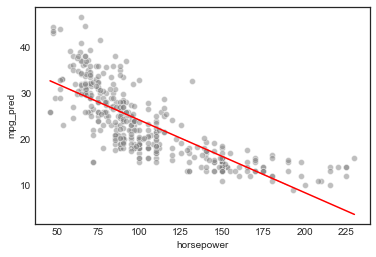
b. Scatterplot and least squares line plot
# setup
import matplotlib.pyplot as plt
import seaborn as sns
import numpy as np

%matplotlib inline
plt.style.use('seaborn-white')
sns.set_style('white')
For convenience, assemble the results in a new dataframe
# get full prediction results
pred_df = model.get_prediction().summary_frame()

# rename columns to avoid `mean` name conflicts and other confusions
new_names = {}
for name in pred_df.columns:
    if 'mean' in name:
        new_names[name] = name.replace('mean', 'mpg_pred')
    elif 'obs_ci' in name:
        new_names[name] = name.replace('obs_ci', 'mpg_pred_pi')
    else:
        new_names[name] = name
pred_df = pred_df.rename(new_names, axis='columns')

# concat mpg, horsepower and prediction results in dataframe
model_df = pd.concat([X, Y, pred_df], axis=1)
model_df.head()
| const | horsepower | mpg | mpg_pred | mpg_pred_se | mpg_pred_ci_lower | mpg_pred_ci_upper | mpg_pred_pi_lower | mpg_pred_pi_upper | |
|---|---|---|---|---|---|---|---|---|---|
| 0 | 1.0 | 130.0 | 18.0 | 19.416046 | 0.297444 | 18.831250 | 20.000841 | 9.753295 | 29.078797 |
| 1 | 1.0 | 165.0 | 15.0 | 13.891480 | 0.462181 | 12.982802 | 14.800158 | 4.203732 | 23.579228 |
| 2 | 1.0 | 150.0 | 18.0 | 16.259151 | 0.384080 | 15.504025 | 17.014277 | 6.584598 | 25.933704 |
| 3 | 1.0 | 150.0 | 16.0 | 16.259151 | 0.384080 | 15.504025 | 17.014277 | 6.584598 | 25.933704 |
| 4 | 1.0 | 140.0 | 17.0 | 17.837598 | 0.337403 | 17.174242 | 18.500955 | 8.169775 | 27.505422 |
# plot
sns.scatterplot(model_df.horsepower, model_df.mpg, facecolors='grey', alpha=0.5)
sns.lineplot(model_df.horsepower, model_df.mpg_pred, color='r')
c. Diagnostic plots
This exercise uses R’s plot() function, which by default returns four diagnostic plots. We’ll recreate those plots in python 1
Studentized Residuals vs. Fitted plot
This helps identify non-linearity
# add studentized residuals to the dataframe
model_df['resid'] = model.resid

# studentized residuals vs. predicted values plot
sns.regplot(model_df.mpg_pred, model_df.resid/model_df.resid.std(), lowess=True,
            line_kws={'color':'r', 'lw':1},
            scatter_kws={'facecolors':'grey', 'edgecolors':'grey', 'alpha':0.4})
plt.ylabel('studentized resid')
Text(0,0.5,'studentized resid')
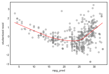
This is a pretty clear indication of non-linearity (see p93) of text). We can also see some outliers
QQ-plot of Residuals
This tests the assumption that the errors are normally distributed
# plot standardized residuals against a standard normal distribution
sm.qqplot(model_df.resid/model_df.resid.std(), color='grey', alpha=0.5, xlabel='')
plt.ylabel('studentized resid quantiles')
plt.xlabel('standard normal quantiles')
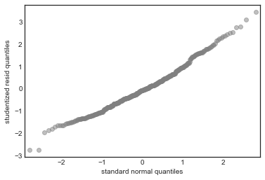
In this case there’s good agreement with the normality assumption
Scale-location plot
This tests the assumption of homoscedasticity (equal variance) of the errors
sns.regplot(model_df.mpg_pred, np.sqrt(np.abs(model_df.resid/model_df.resid.std())), lowess=True,
            line_kws={'color':'r', 'lw':1},
            scatter_kws={'facecolors':'grey', 'edgecolors':'grey', 'alpha':0.4})
plt.ylabel('√|studentized resid|')
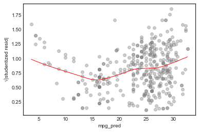
In this case, the assumptions seems unjustified.
Influence Plot
This helps identify influence points, i.e. points with an “outsize” effect on the model 2
# scatterplot of leverage vs studentized residuals
axes = sns.regplot(model.get_influence().hat_matrix_diag, model_df.resid/model_df.resid.std(),
            lowess=True,
            line_kws={'color':'r', 'lw':1},
            scatter_kws={'facecolors':'grey', 'edgecolors':'grey', 'alpha':0.4})
plt.xlabel('leverage')
plt.ylabel('studentized resid')

# plot Cook's distance contours for D = 0.5, D = 1
x = np.linspace(axes.get_xlim()[0], axes.get_xlim()[1], 50)
plt.plot(x, np.sqrt(0.5*(1 - x)/x), color='red', linestyle='dashed')
plt.plot(x, np.sqrt((1 - x)/x), color='red', linestyle='dashed')
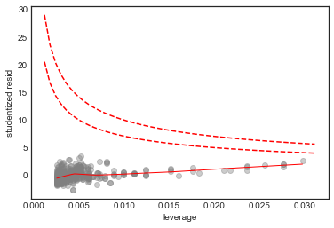
No point in this plot has both high leverage and high residual, and all the points in this plot are within the Cook’s distance contours, so we conclude that there are no high influence points
Footnotes
-
This Medium article addresses the same issue. ↩
-
This Cross-Validated question was helpful in figuring out how to plot the Cook’s distance. ↩